Premium Category Products
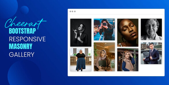
Cheerart – Bootstrap Responsive Masonry Gallery
Last Updated :
Current Version :
Cheerart – Bootstrap Responsive Masonry Gallery
✨ Latest Version
- Safety, Guarantees Files
- Malware-Free (Clean) Files
- License: GPL Preactivated
- Unlimited Site & Domain Usage
Steps to Implement Cheerart - Bootstrap Responsive Masonry Gallery
1. Setup Your Project
- Create your project folder: You can start by creating a new folder for your project.
Explanation of the Code
- Bootstrap Grid System: The gallery layout is achieved using Bootstrap’s grid system. The
.rowclass defines the row of items, and.coldefines each column. Therow-cols-1androw-cols-md-3classes make the gallery responsive. It displays 1 column on small screens and 3 columns on medium and larger screens. - Gallery Items: Each gallery item is wrapped in a
.colwith an image inside. The images are displayed using theimgtag with asrcpointing to the image URL. - Custom CSS: The
.gallery-itemclass provides spacing between the images, and the images are styled to be responsive and have rounded corners.
4. Add Masonry Layout with JavaScript (Optional)
To achieve the masonry effect, you can use a JavaScript library like Masonry.js or Isotope.js. However, Bootstrap’s grid system already provides a responsive layout, and withrow-cols, you can achieve a similar effect.
Main Features
- Based on Bootstrap
- Valid HTML5 & CSS3
- W3 Validate
- Full Responsive
- Easy Customize
- Clean & Modern Design
- Boxed Layouts
- Grid & Cobbles Version
- Cross Browser Support
- Sortable columns
- Well documented
- No Error !
- Google Fonts
- Bootstrap
- Jquery
- Fancybox
(Only For Premium Category Products !)
1. All digital products are the most recent version, with no possibility of free updates. After payment, you can request an update to the most recent version for 5 days if a new version is released. We free support within 5 days.
2. If a license is required (Excludes WHMCS license , we provide only method not license), please contact us via email or ticket for assistance with activation. Our license is only valid for activation and does not include support.
3. We provide Mobile, PHP script installation services for $19.90 / ₹1700. Please create a backup after installation as we do not support re-installation. For mobile app source code, we do not offer installation services.
4. If you have any questions, please contact us by email [email protected] or create a ticket on this page
5. Please note that any digital products presented on the website do not contain malicious code, viruses or advertising. You will receive the original files from the developers. We do not sell any products that have been downloaded from other websites.
6. The response time can last up to 6 hours.
(Only For Membership Category Products !)
Benefits of our Membership Plans
- Instant access to all plugins and all themes including all future releases
- Unlimited domain usage
- Regular Updates as of when available. Usually, updates are released daily.
- Before purchasing, please read the Terms and Conditions & Refund Policy.
- If you have any questions, please first read the FAQs.
- If you haven’t found the answer to your question, please contact us, and we will respond ASAP.
- Please note that any digital products on the website do not contain malicious code, viruses, or advertising. We buy the original files from the developers. We do not sell any products downloaded from other sites.
- Buy or download for FREE by subscribing to our VIP Membership Plan. Join the club of more than 1100+ happy members. This is the same theme as sold by the developer.
Updates:
- We offer frequent updates for one year from the date of purchase. After this period, you have to purchase the item again to receive further updates, we also offer lifetime updates as a second option.
- We regularly update products as soon as we are notified about an update, we go and download it from the author and update it on our site, but In case the current version of the product is not the latest, You can request an update for the product by contact form.
- We send regular emails advising when products have been updated so please be sure to provide an active email address when you sign up.
Support:
- Our support team is available 24/7, if you have any questions or need help in installing or configuring digital products purchased on the website, please don’t hesitate to contact form.
- Please note that we are not developers of the provided products, so our technical support capabilities are limited. We do not change product functionality and do not fix developer bugs.
(Only For WHMCS Category Products !)
- We Only provide WHMCS Module, how you can nulled any module step only !
- Instant access to all plugins and all themes
- Unlimited domain usage
- Regular Updates as of when available. Usually, updates are released daily.
- Before purchasing, please read the Terms and Conditions & Refund Policy.
- If you have any questions, please first read the FAQs.
- If you haven’t found the answer to your question, please contact us, and we will respond ASAP.
- Please note that any digital products on the website do not contain malicious code, viruses, or advertising. We buy the original files from the developers. We do not sell any products downloaded from other sites.
